Using the Bell Curve to Set Goals and Predict Success
When did this…
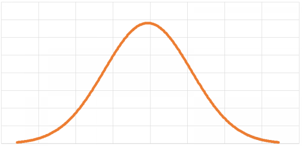
…become hotter than this?
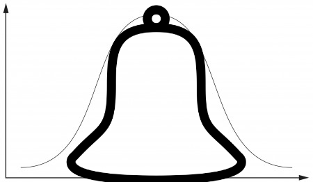
End the impossible standards set by analysts. All graphs are beautiful!
We’ve all heard of the bell curve before. That little graph that’s actually called The Graph of the Normal Distribution, but – because of its shape – is colloquially referred to as the bell curve.
It’s a gorgeous little graph, isn’t it?
An incredibly diverse and incalculable number of phenomena can be represented by the bell curve: IQ scores of college students; average number of homes sold during the month of March; mating habits of the Australian Snubfin Dolphin; you name it! The practicality of this graph cannot be overstated.
To fully appreciate the bell curve’s significance, we need to understand how it works. Let’s take a look at a few of its features:
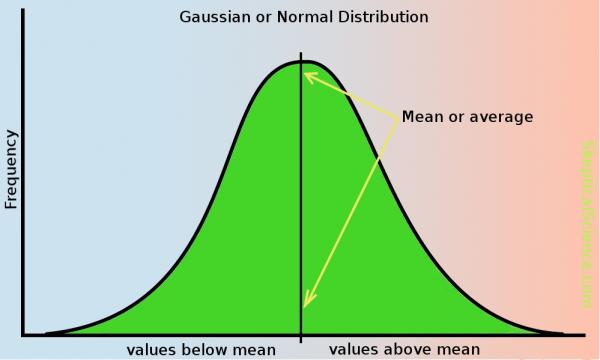
The x-axis is usually some sort of measurement or score: Average female height, SAT scores, etc. The y-axis gives us the number of times each of those measurements occurred.
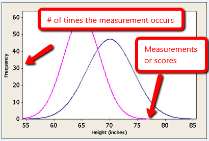
SOURCE: usablestats.com
The middle of the graph is usually the highest point and represents the most commonly occurring measurement or score. In a normally distributed graph, the most frequently occurring score (commonly referred to as the mode) is also the average of all the scores.
SOURCE: skepticalscience.com
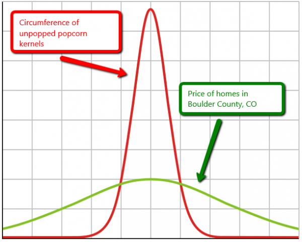
The width of the bell curve tells us a lot about how much variance there is in the data. A wide bell curve is representative of data that has a high degree of variance. One example of such data would be home prices in Boulder County, CO. In 2015 homes in the area sold for anywhere between $40k and $5 million. That graph would be very wide.
An example of data with low variance – and therefore a narrow bell curve – might be found in measuring the circumference of unpopped popcorn kernels.
Statisticians use the standard deviation to represent the variance in a bell curve. High variance = a large standard deviation. Low variance = a small standard deviation. The nice thing about standard deviations is that they – regardless of how large or small they are – represent the same proportion of their respective graphs. An increase of 1 standard deviation on a normal bell curve, for example, will always be equal to an increase of 34%. This is part of the empirical rule and it holds true for any data measured using a bell curve.
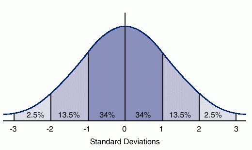
Source: ck12.org
This consistency allows us to standardize our descriptions of data. Take IQ scores for example. The average IQ score is 100, with a standard deviation of 15. So you know that someone with an IQ score of 115 is going to be 34% more intelligent than the average person (feel free to use the comments section below to debate the merits of using the IQ score as a measure of a person’s intelligence).
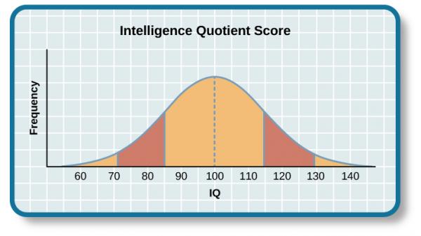
SOURCE: cnx.org
Let’s apply all of this to a real-world example to see how we can use the bell curve to set marketing goals.
Suppose your management team is considering adding one of the increasingly popular social media sign-up buttons to your company’s website, like the ones pictured below.

[SOURCE: SurveyGizmo]
Your resident analysts have noticed an increase in the registration fallout rate (the percentage of people who start the registration process and then, for one reason or another, don’t end up completing it). The hope is that adding a social media sign-up button would simplify the registration process, thereby increasing the total number of registrations. They’ve tasked you with determining how many more registrations would be needed in order to consider the social media sign-up feature a success.
Time to do some math!
We’ll first need to take the arithmetic mean of all your numbers and then, for each number, calculate the squared difference of that number and…
Just kidding! We went ahead and created a handy little tool that does all of that for you. You didn’t think we were actually going to make you do all that math, did you? In fact, you won’t have to do any math at all (you’re welcome). Let’s walk through the Confidence Interval Goal Setter.
Download the workbook and go to the “Enter Your Data Here” worksheet. You’ll notice that the workbook comes preloaded with some sample data. We’ll use this as our historical registration completions numbers. Each row represents the total registrations for a given day.
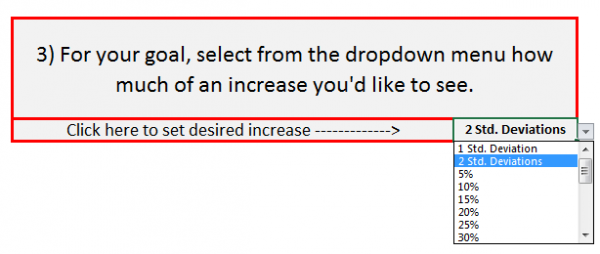
Go to step 3 (we’ll come back to steps 1 and 2 later on) and click on cell J10 to bring up the pull-down menu. This is where you’ll select how much you want your data’s average to increase. Using our social media sign-up example, let’s say you need to see a 30% increase in registration completions in order to justify the cost of adding the button. So, we simply select 30% from the pull-down menu, and voilà! Your bell curve is now ready for you in the Report worksheet.

Looking at your report, you’ll see that your average registrations count was originally 21.6 per day. If we keep the desired increase set at 30%, we see that your target average is 30 registrations per day. And, as promised, you didn’t have to do any math at all (you’re welcome, again).
“But Nick, I don’t really know how much of an increase I need. Isn’t there some way to use this totally rad tool to set a goal?”
Of course there is!
You’ll recall that, regardless of what we’re measuring, a one standard deviation increase is always a sizable increase, and a two standard deviation increase is even larger than that. So, to set a goal with a respectable increase, just select “1 Std. Deviation” from the pull-down menu. Select “2 Std. Deviations” if you really need to aim high.
How awesome is this thing???
Go ahead and play around with it a bit to see what effect changing the desired increase has on the graph. To add your own data to the worksheet, just follow the three steps below:
- Click the “Clear Data” button near the top of the page to clear any previously entered data. Click this at your own risk. Once you click the button, the data will be gone forever.
- Copy your data from your source workbook and paste it into cell A10. A couple things to keep in mind:
- You can only analyze one metric at a time, therefore you should only be pasting one column of data in cell A10.
- Absolutely NO BLANK ROWS are allowed in column A. As handy as this tool is, it doesn’t quite know what to do with blank rows. If you have any blanks in column A, it will assume that it has reached the end of the line and will ignore all data after the blank.
- Lastly, go to the pull-down menu in cell J10 to select how much of an increase you’d like to see in your data’s average.
Happy predicting!
By Todd Gamber · February 4, 2019
← All Posts