Data is a scorching hot topic thanks to the rise of Big Data, data science, and machine learning, but is it really making your business better? Despite huge technical innovations that dispense more and more numbers, business fundamentals remain unchanged. Data, like people and capital, is simply another resource that needs to be managed effectively to produce real results. Use these tips to get the most out of your data initiatives:
Stay Focused
Data leads to action when explicitly tied to specific business priorities or problems. Though stumbling on hidden nuggets of magical data insights within haystacks makes headlines, the reality is that a disciplined strategy has far better odds of success. Tightly target projects with solid a plan, starting by documenting goals or questions to answer. Decide how to measure or evaluate, and envision potential responses to results. While these may change in practice, thinking through possible outcomes helps avoid ending up with non-actionable numbers. Here are some critical questions to ask while planning:

- What specific business goal or priority will this data support?
- At what point will this data indicate success or failure?
- Can we influence the factors that affect this data?
- What should the end product look like?
- Who will see it?
- What actions will be taken once the data is produced?
Root Out Bias
Data may be impartial, but utilizing it is definitely not. We are all human and prone to bias, conscious or unconscious. Resist the urge to cherry-pick data to support a predetermined conclusion, whether it’s searching out only “good” metrics or suppressing “bad” numbers. Reach beyond metrics that boost your ego to those that actually teach you something.
- Critically question reasons for including or excluding certain data points or time frames, and consider annotating outliers rather than excluding them
- Soften the blow of poor performance data by coupling it with specific positive actions to improve
- Focus on data that helps hit YOUR goals instead of comparing to others. Industry standards and competitor metrics are interesting, but don’t settle for someone else’s idea of success.
Design Smart
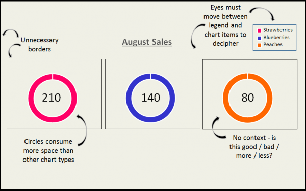
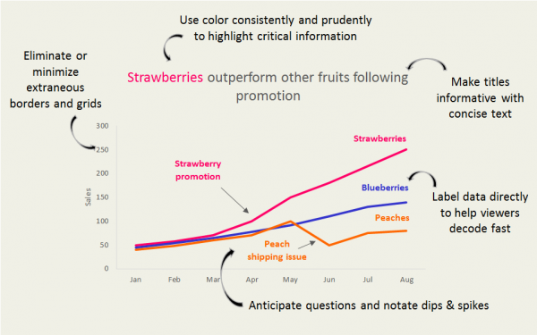
After data is gathered, visuals can help both analyze and communicate it to stakeholders. Design is often thought of as making pretty charts or decorating numbers, but great visualizations really do save time, help viewers process more information, and often show context more effectively than text. Guide the audience through a story by minimizing distraction, using clear and concise text, and providing appropriate comparison points.
Here are some common chart design elements worth reconsidering:
Here are a few suggestions to add value to visualizations:
Want to find more meaning in your data? We can help!
Contact Confidence Interval for a consultation.
By Todd Gamber · February 4, 2019
← All Posts